CalArts style. Whether you’re a professional animator or just a daytime doodler, chances are you’ve heard of the term, which unleashed a torrent of outrage from animation fans, including Twitter storms, irate comment sections, and ranty blog posts.
But what is it, exactly? And how did it find itself on the receiving end of online fury? In this article, we’ll take a look at the history and controversy behind CalArts style and try to answer the following questions:
- What is CalArts style
- Who invented CalArts style
- Is the CalArts conspiracy a thing
Let’s dive right in!
What Is CalArts Style
The term CalArts style started out in 2010 as an insult coined by The Ren & Stimpy Show creator John Kricfalusi intending to dismiss films like The Iron Giant made by CalArts alumn Brad Bird. In a now-deleted blog post, Kricfalusi accused young animators of regurgitating Disney-esque animation style without mastering the underlying animation skills.
But this original meaning was completely warped and lost over time.
CalArts has become notorious as a way to describe the somewhat simplistic animation style that has been popping up in the 2010s crop of cartoons, including Steven Universe, Gravity Falls, Star vs the Forces of Evil, ThunderCats Roar, The Amazing World of Gumball, Adventure Time, Over the Garden Wall, Clarence, and apparently Undertale, the indie video game. Also referred to as thin-line animation, it has been derided as unoriginal and childish.
If you’ve been on the internet the last few years (especially around the announcement of ThunderCats Roar reboot in 2018), you may have seen this meme of a simple bean-shaped head and ovular-shaped smile altering ever so slightly, each morphing into a different cartoon character.
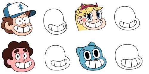
It graced many Twitter feeds, essentially illustrating the point that all 2010s cartoon character designs looked the same, as they were drawn with thin lines and featured round body shapes, big eyeballs, and toothy crescent grins.
On top of that, many tweets contained accusations that these cartoon shows had been created by people who attended CalArts — apparently, some social media users believe that the rounded ball-and-noodle art style is favored by the CalArts curriculum and therefore pushed onto its students, who then go on to employ it in their shows.
Wait, What Is CalArts Again?
CalArts, short for the California Institute of the Arts, is one of the biggest and most well-known art schools in the world, founded in 1961 by the most durable name in the industry, Walt Disney himself.

CalArts alumni are typically scooped by Pixar, Lucasfilm, DreamWorks SKG, Disney, and the other majors and, as a result, often help shape the defining animation style of a given decade.
So, did all the artists behind the most popular 2010s cartoon series really go to CalArts?
Here’s a quick fact-check.
It turns out that while Daron Nefcy (Star vs the Forces of Evil) and Alex Hirsch (Gravity Falls) did indeed learn at CalArts, Rebecca Sugar and Ian Jones Quartey (Steven Universe) both came from SVA, Ben Bocquelet (The Amazing World of Gumball) studied at École des Métiers du Cinéma d’Animation, and Victor Courtright (ThunderCats Roar) graduated from MCAD.
So, Is CalArts Style Even a Thing?
It seems that CalArts style doesn’t exist, or at least definitely not in the way many people think it does.
More often than not, the term is used as a catchall for what many fans see as a cookie-cutter style of thin-line animation lacking in originality and effort. Or sometimes, whatever popular animation style they don’t like at the time.
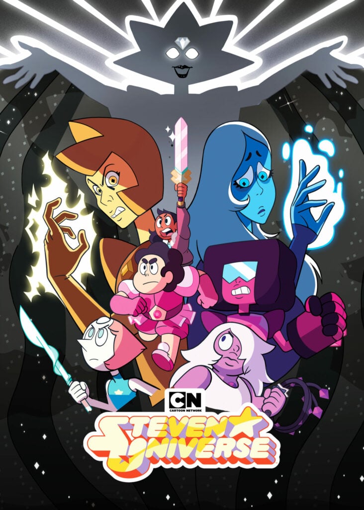
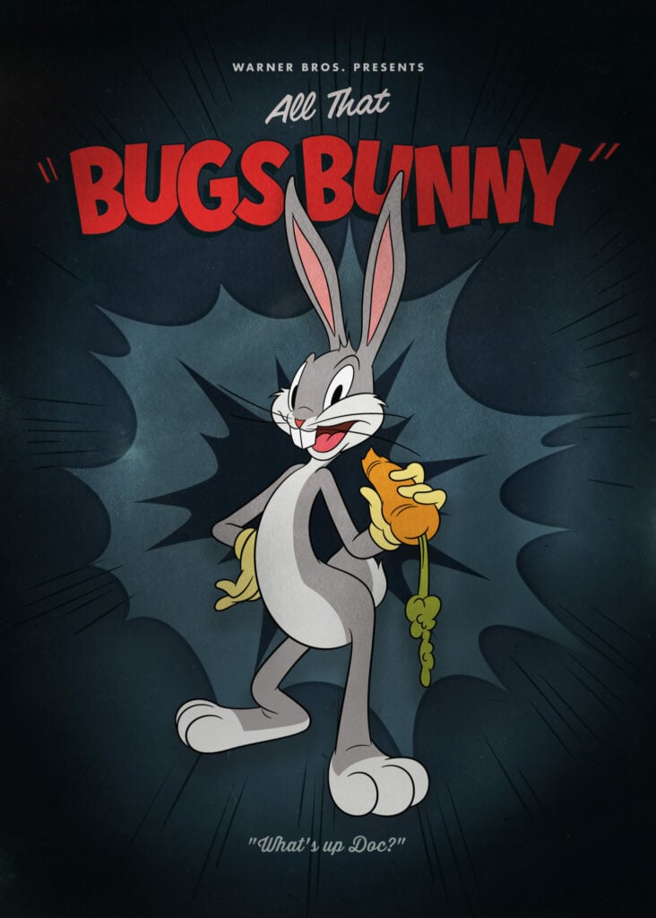
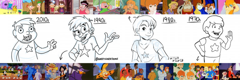
Different cartoon shows are being lumped together and labeled “CalArts,” with disgruntled animation fans calling them lazy and derivative. At the same time, people are raving about how cartoons used to look their best back when they were kids. It seems that to everyone, no matter how old they are, cartoons were always at their very best when they were introduced to them as little kids — funny how that works.
Some social media users have gone as far as to say that the “CalArts” style is part of a malicious plot to homogenize the animation industry. Still, there are more plausible explanations other than a cartoon conspiracy theory that account for the popularity of the style.
For starters, thin-line animation has a lot to do with the shift from pencil and paper to digital animation. Drawing with thin lines makes the animation process easier and faster in Flash and other computer programs, which is why thin-line animation is more popular now than in the 1990s and early 2000s when traditional hand-drawn animation prevailed.
While we’re on the subject: you might find it interesting that 1989 The Little Mermaid was the last Disney feature film to use the traditional hand-drawn cell animation method.
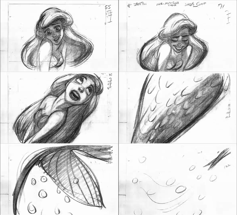
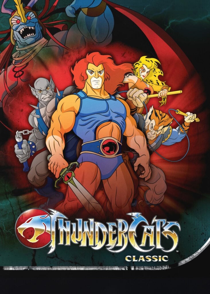
The widespread adoption of high-definition television is not without significance, too. Before HD, small features such as thin lines in an image were a rarity. Do you recall the thickly outlined characters of the 1950s and 1960s, like the muscle-bound Mighty Mouse or the mid-1960s futurism staple The Jetsons? Thick outlines were a design trend adopted by TV cartoon creators precisely because, back in those days, over-the-air television reception was awful.
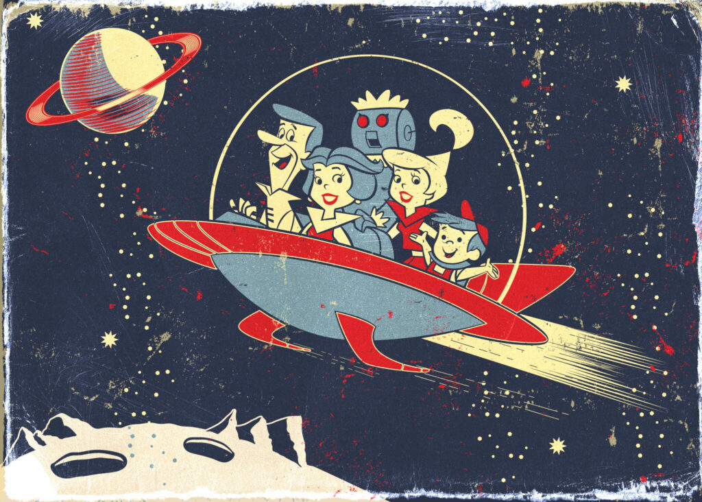
Last but not least, Western animators have switched to less detail and simple character design as a result of the ’90s anime boom. The success of titles like Dragon Ball, Rurouni Kenshin, and Sailor Moon inspired major animation studios to experiment with their own style of the thin-line, big-eye look, and the rest is, as they say, history.
That’s All, Folks!
CalArts style has produced unforgettable characters and dreamy realms, spawning dedicated fan bases despite controversies. In this article, we tried to unveil the mystery of its origin, address some misconceptions, and set the record right for posterity. We hope this little deep dive helped clear up some questions you may have had but didn’t dare to ask.
For more animation-related articles, check our guide to rubber hose animation. And if you’re looking to dress up your walls, have a browse through our selection of licensed cartoon designs printed on metal here at Displate. From classics like Looney Tunes, Cartoon Network, and Hanna-Barbera to modern hits like Sponge Bob and Rick and Morty, we’ve got them all!
What’s your take on the “CalArts” style? As always, hit up the comments and let us know your thoughts.
