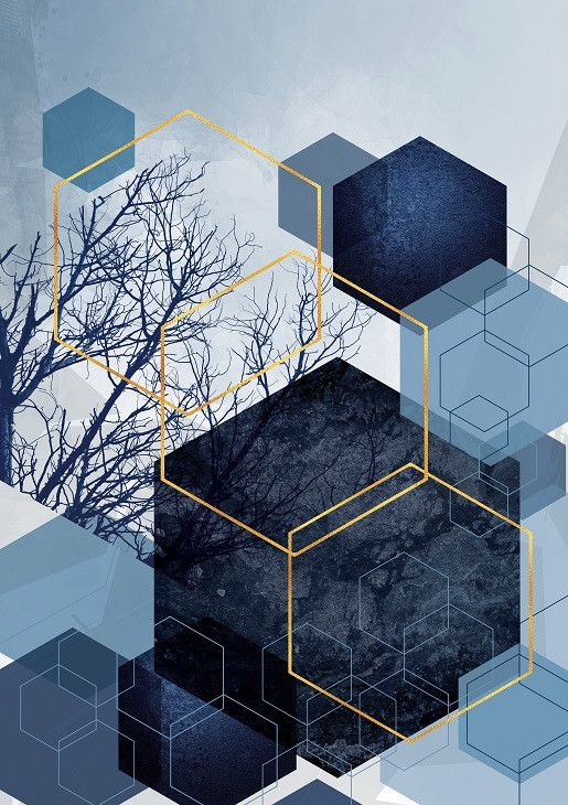
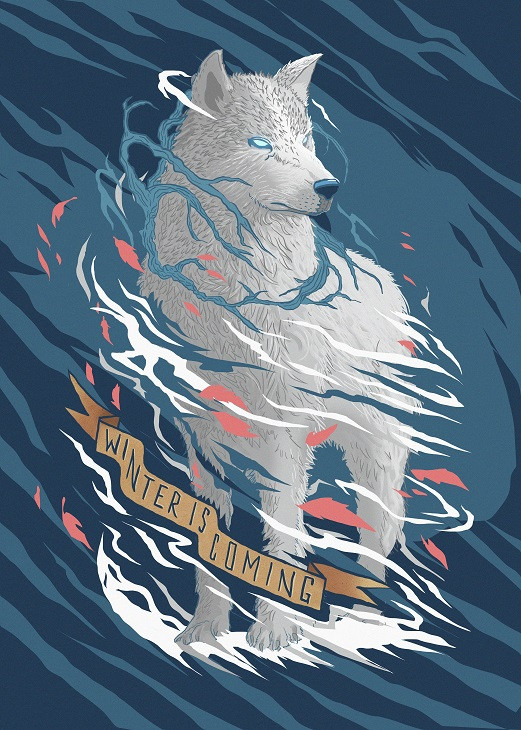
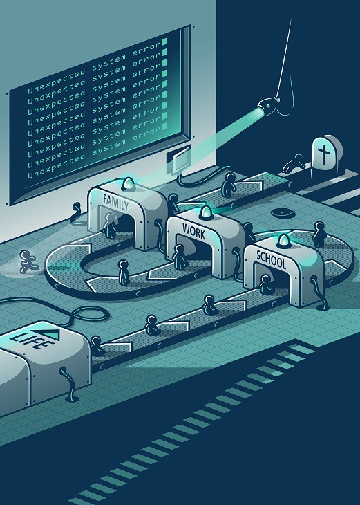
Once a year, Pantone analyses worldwide trends in home decor, design, art and illustration, and announces the color that will dictate trends in the whole business. From now on everything will be covered with blue. Classic Blue.
What does this color represent?
Think of the color that makes you calm and happy. That takes you to a better place, where you can be the best version of yourself.
This year Pantone gives us the tone that represents everything peaceful, elegant and wise. It does not make you feel blue but relaxed. It creates a feeling of relief in times when the world is fast and overwhelming sometimes.
Instilling calm, confidence, and connection, this enduring blue hue highlights our desire for a dependable and stable foundation on which to build as we cross the threshold into a new era.
Feeling the slow-life vibe coming out of this color already?
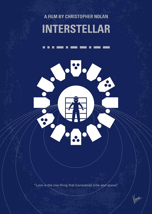
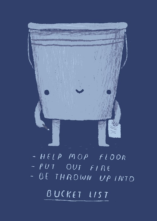
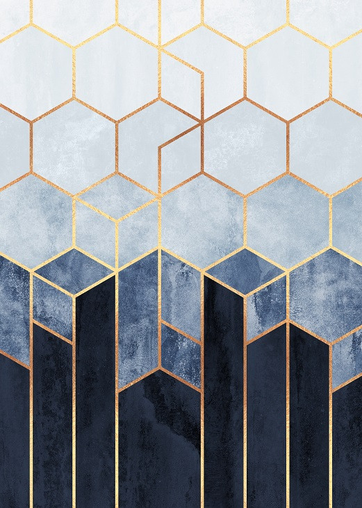
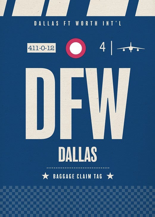
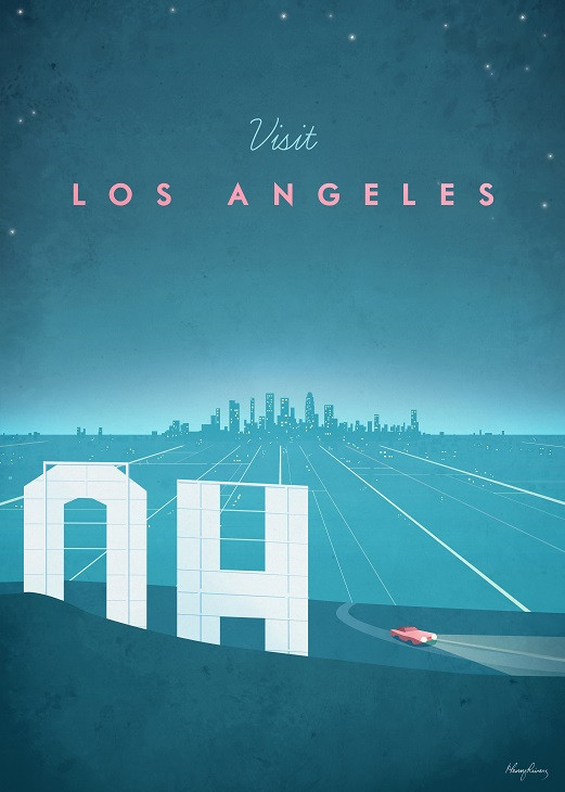
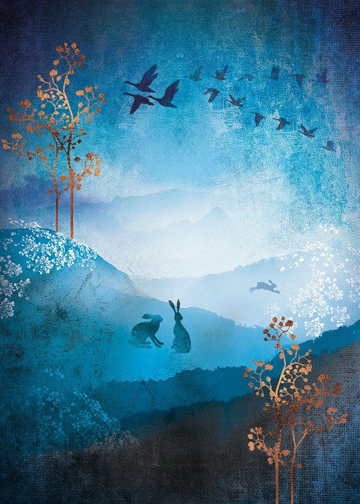
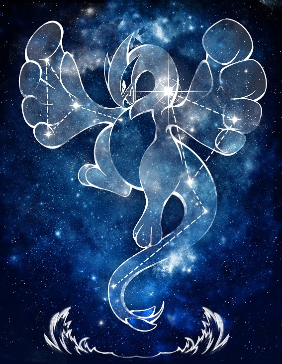
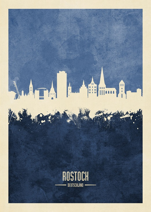
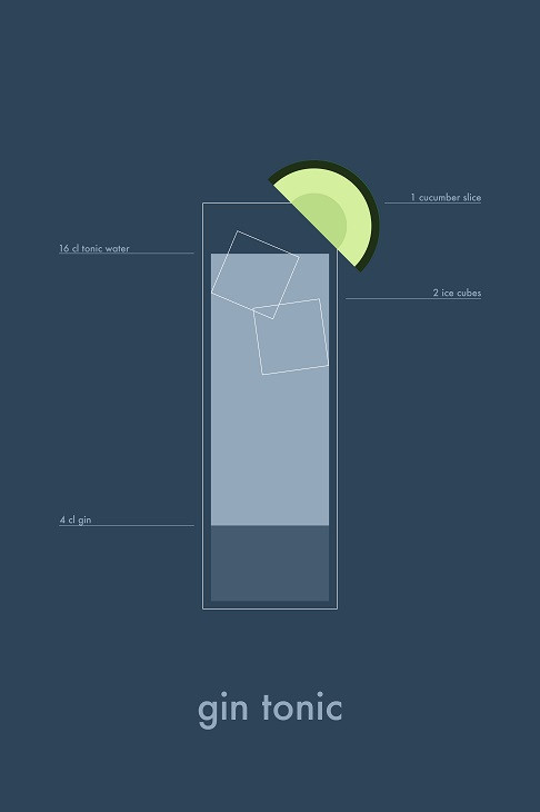
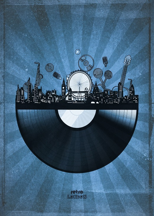
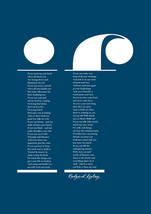
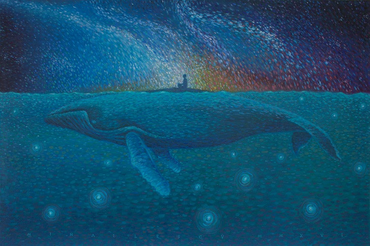
We hope you do because you should keep it classy and use this tone as much as you can this year. And meanwhile, check out 20 Displates in various shades of blue, coming really close to the right tone.
