Welcome to another installment of Gaming Art Styles where we showcase popular graphics solutions that were fundamental in gaming evolution. In the previous chapter, we depicted a rotoscope technique, popularized by Prince of Persia game from 1989. Today, we’re going to take a few steps back in time and show you how game designers made 3D. In the 80s.
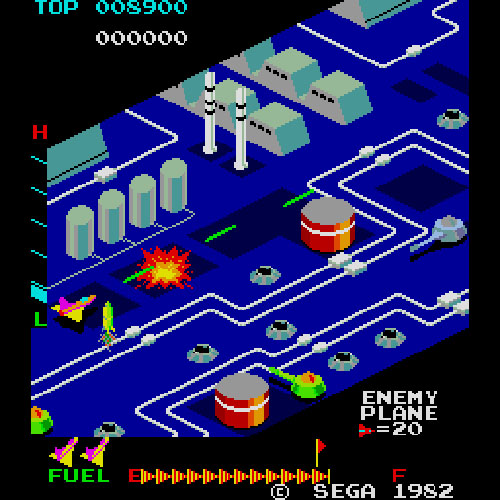
The first to use this kind of technology was Sega. In January 1982 they released arcade shooter called Zaxxon. What’s special about it is the fact that it applied isometric viewpoint. It was also the first game to display shadows.

What’s an isometric graphics anyway?
It’s a technique that allows flat two-dimensional objects look like 3D images. The viewpoint is angled in a way that reveals a larger portion of the game environment than in regular top-down perspective or side-scroll one. It’s a way to trick the eye to see 2D sprites as if they’re three-dimensional – using the example of Zaxxon – by having ship pass behind some elements of the environment. Simple yet effective. From now on, games started to look like really something.
After Zaxxon came Q*bert (1982), Congo Bongo (1983) and Ant Attack (1983). The huge leap forward in terms of art style came with the introduction of Knight Lore (1984) on ZX Spectrum, which defined the still-developing genre of action adventure games.
Most of the most successful games of the 90s were developed using the aforementioned technique. I bet you still remember fondly playing Diablo, SimCity 2000 or Civilization – yes, those were made in isometric 3D. it’s worth noting that Black Isle Studios were the main force behind the popularization of isometrics in RPGs throughout their Fallout and Baldur’s Gate series. 1990s were also very prolific for jRPG genre that bloomed with games like Tactics Ogre.

What’s so special about isometric graphics?
First of all, it’s the easiest way to create a faux-3D environment without extra work of scaling objects and simulating perspective. Even though there might be minor issues with a correct projection of depth, it’s nothing thoughtful design wouldn’t fix.
Secondly, it adds another dimension to the gameplay that previous 2D games couldn’t offer, such as additional platforming options or controlling characters in a more broad manner in RPGs. Moreover, its convenient designs allows player to focus on gameplay alone rather than a camera (which at that time was an issue in 3D games)
Finally, 2D games are considered to age better than it’s three-dimensional counterparts. Those games also need lower hardware requirements to actually enjoy them. I know it’s not a problem nowadays, but two decades ago it really mattered.
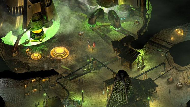
Now more and more developers decide to go full 3D rendering even for mobile games, but there are still those who merge two mentioned graphics, for example, recent Torment: Tides of Numenera or upcoming Project Octopath Traveler. It’s a dated art style but it still can pack a punch.

Have you played any of games that used isometric art style? Can you list them? What was your favorite? Let me know in the comment section.

