In this quick guide, we want to give you a few tips on how to make your profile pop, and stand out from other art shops on Displate. Not only will this knowledge help you introduce you and your style to potential customers, but it shall also boost your visibility in search and on the main page.
Ok, so wanna know how to create an awesome artist’s profile? Learn from some tips below.
How to make your artist’s profile stand out
Here are the options you have:
- Pick a nickname
- Write a great bio
- Add a cool profile picture
- Add a great cover photo
- Add links to Youtube and Twitch
Now let’s dive into some details:
1. Pick a catchy nickname
The first step to create your awesome artist’s profile is to pick a good nickname for your shop. If you already have your online portfolio or you are known on social media for a concrete nickname – stay consistent and go for the name you are using.
In this way, you can work on your brand and gain popularity on Displate and on the Internet in general.
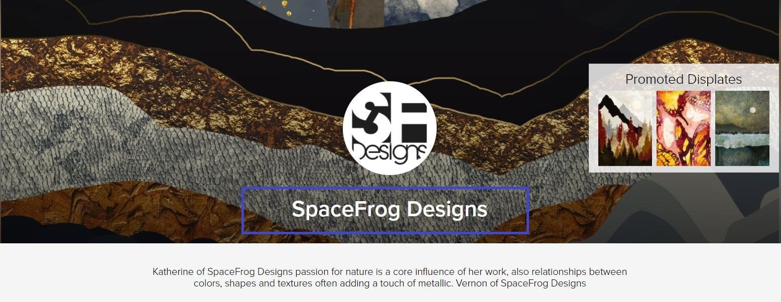
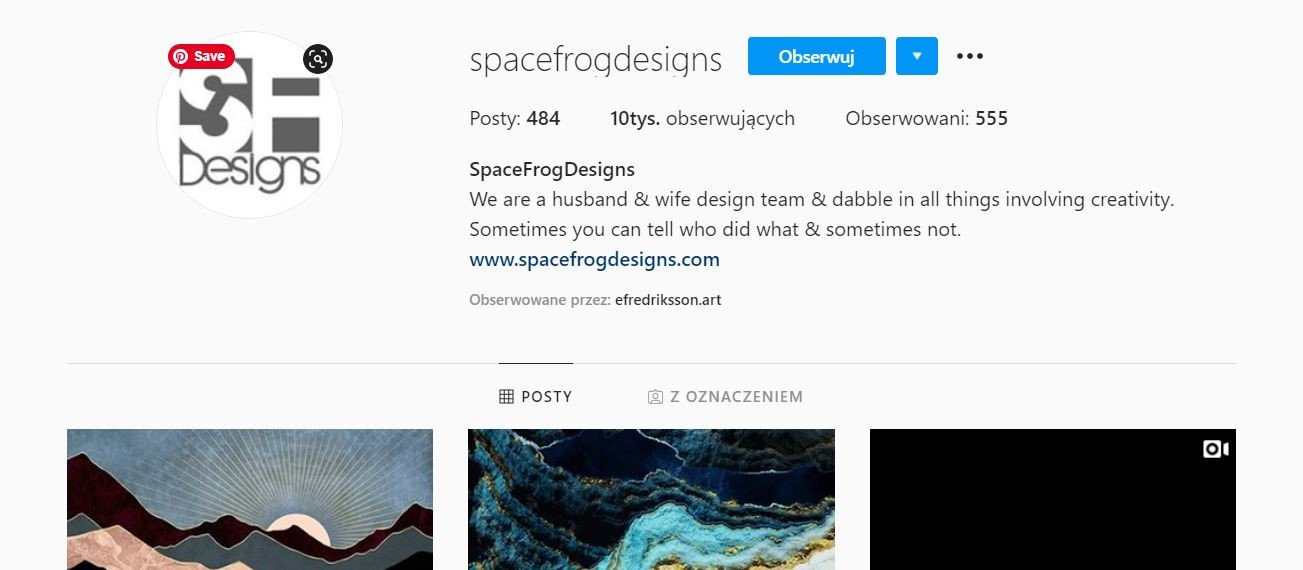
Here is an example of the artist SpaceFrog Designs, who is consistent in terms of picking the nickname on various websites:

2. Write a short yet informative bio
On Displate, you have 200 characters to attract customers, available in the description box. The best artist’s bio should be both informational and current. It has to say less about you, and more about your style and the details of your work.
Basically, there are 4 things you can add:
- a place that you are from or that you are based in
- your style and technique you use
- your biggest inspirations
- your achievements so far (awards etc.)
Your profile description should be written in English so that it is understandable for everyone. If you do not feel comfortable writing in English, it is good to double-check it with a native speaker.
Remember, it is not a masterpiece you are writing. If it is not really your thing, ask someone to review it for you.
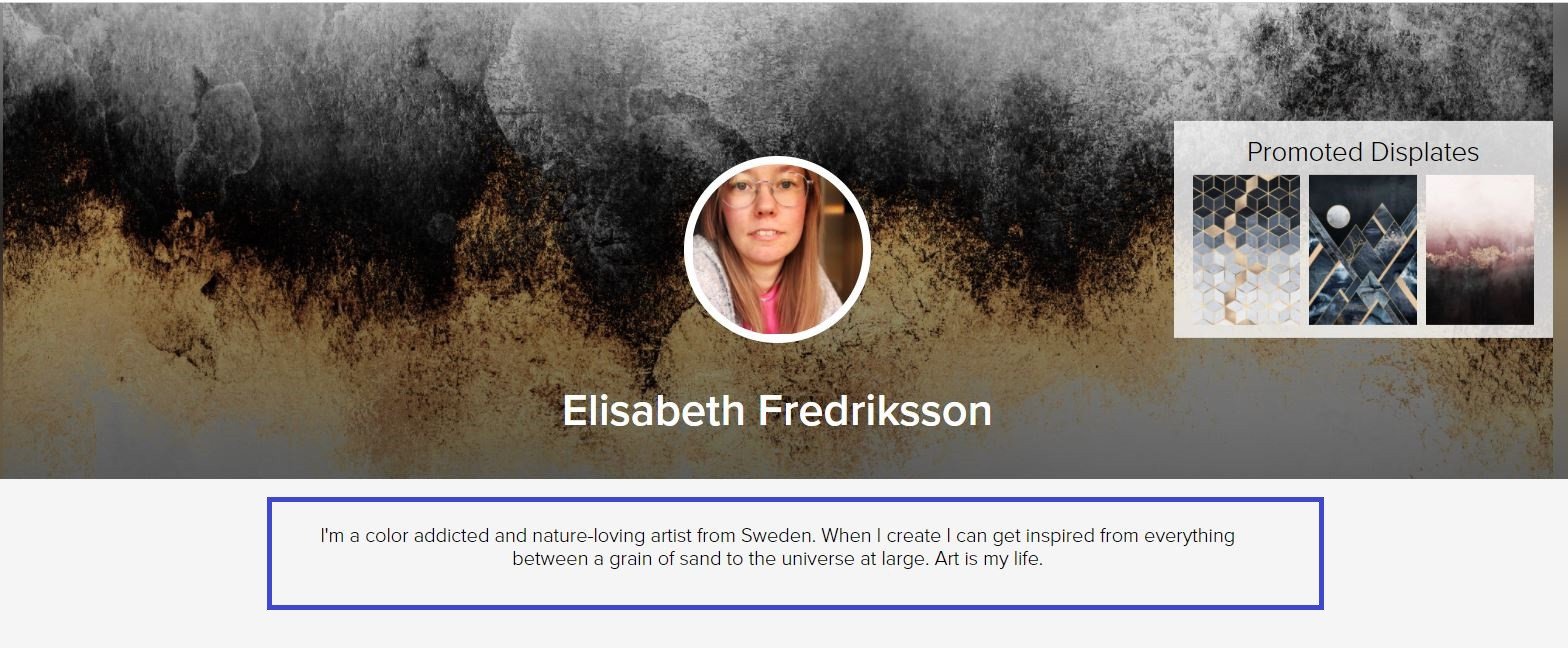
Look, Elisabeth Fredriksson gets straight to the point – her bio is descriptive and creative, that’s basically what you need to achieve:
So, introduce yourself, tell everyone what you do, and give it all a witty vibe.
3. Add a cool profile picture
Prove to your customers that you are real. Whether you use your own photo, a logo or a drawing made 100% by you, your profile picture should show you or something directly associated with you or your art.
Here is the example of the artist Jojoesart, who decided to use his logotype as a profile picture:
The size of the profile picture on Displate is 430×430
4. Add a great cover photo
You are a creative beast. Use all options you have to show off your brand and design a great-looking cover to attract customers.
Here is a good example of how to make your profile look awesome, by one and only Mat Miller:
The size of the cover photo is 1240×398 (max 1MB).
5. Add links to Youtube and Twitch
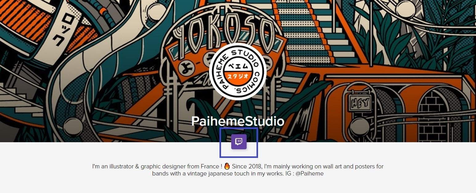
If you promote your art or create tutorials on Youtube or Twitch, paste the links to your pages while describing the profile. They will be visible under your profile picture. It is an extra option for customers to get to know you better and for you to gain some new followers.
Keep your profile organized
1. Do not get messy with your collections
It is important to organize your artworks into coherent, thematic collections. Not only does the subject of the collection matter, but also the number of designs uploaded to it. The best number of artworks to start a collection with is 8. We highly advise you not to submit less than that, as it may decrease your visibility on Displate.
Read more about building collections that sell
Remember. Once you create a collection devoted to a particular theme, stick to it. Avoid adding accidental designs that will confuse your clients.
2. Name collections and artworks properly
Once you come up with a number of collections you want to have in your profile, the next step is to name them both properly (so that the name describes what a customer will find inside), and creatively (so that you can show your personality).
So, basically:
- The names need to be descriptive about the art
- They should be unique to a collection or a single piece
Read more about naming your artworks in the right way
3. Use only good tags
Tags are the most important. You need to make your profile look awesome, but you have to keep it professional so that you can increase your impressions, visits, and sales. Proper tag use makes your work easier to be found in our internal search engine, and the more people find it, the better chances of you getting a sale.
Read more about tagging your artworks
4. Describe your artworks in the most adequate way
Ok, so tags are crucial, but they are also hidden from the product page, while the artwork description is visible to everyone who visits your profile. It is essential to both make it sound awesome, and write it using keywords that will help you pop up in Displate’s search engine. Again, the perfect artwork description has to be short and descriptive about the artwork, its style, and techniques used.
Read more about describing your artworks
5. Choose promoted Displates
Boost the visibility of the artworks you are the most proud of by hovering over the thumbnail and clicking on the ‘Promote’ button. In this way, you will suggest your customers your best works, and make it easier for them to make their shopping decisions.
Show us what you got
Now that you know how to make your artist’s profile awesome, let’s make it happen! Use this post and some helpful articles from our blog, and once you’re finished, show us how you did in the comments below!


